Shades of pain

Hello everybody!
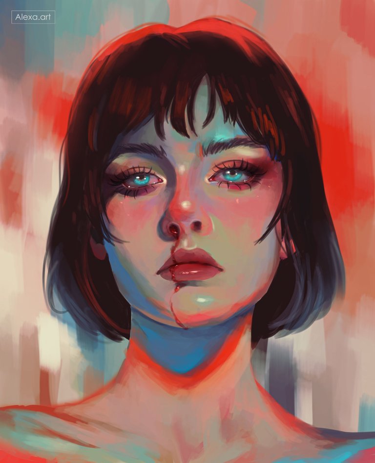
Since a couple of weeks ago I had not had enough time to do a free drawing, something that made me feel good and represent as an artist, those drawings I started with a long time ago but this time I wanted to experiment something new, I have seen many illustrations that play with colors that you would never think of combining and in the end give a wonderful result, in other opportunities I have done drawings with mixtures of different colors and I have always liked them, however, it is not something I can still do every day (although I would like to) because it is quite complicated to understand how and which colors to use correctly to give lights and shadows, today I have used red, orange, green, blue, pink and even brown, my 4 years ago self would think it would be impossible to make a drawing with these tones but today I have achieved it and I liked it very much, this drawing transmits me pain and nostalgia in spite of having vibrant colors that normally we associate with positive feelings and that is where I find the most interesting of all this work, I hope you like it as much as I liked it.

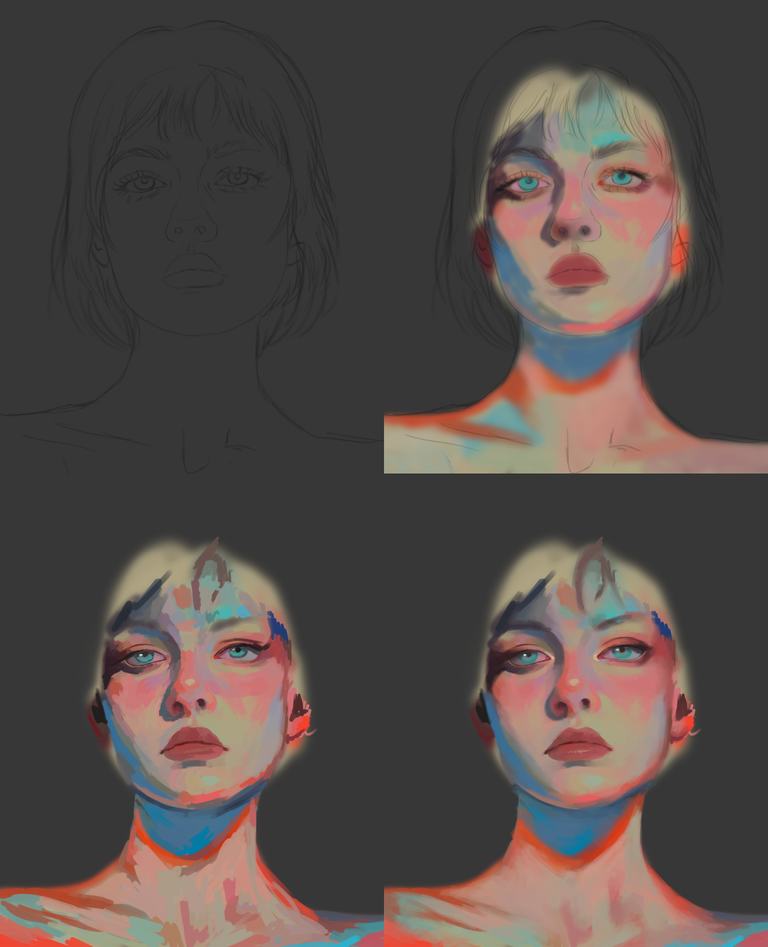
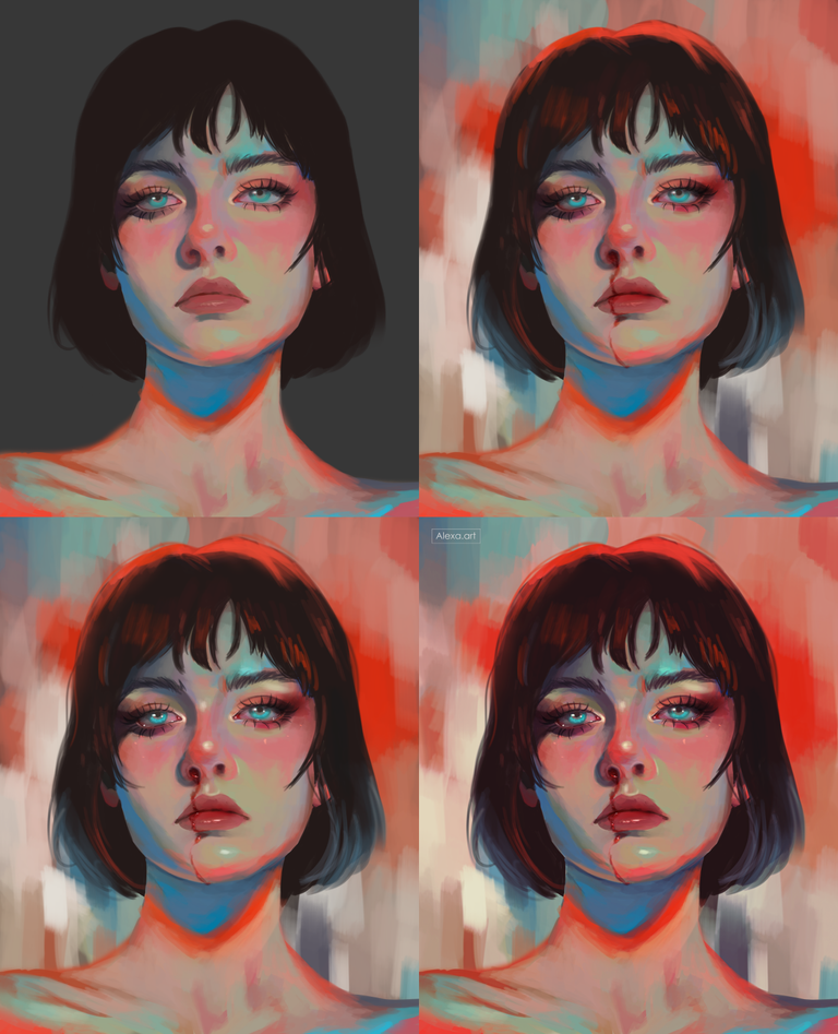
This time I made the sketch of a face looking from the front, I started filling the skin with a pink tone and then I added shadows and lights using different combinations in which we can see: blues, greens, oranges, pinks and browns, in a new layer I added more colors to finish forming the whole face, then I started to mix everything using a chalk texture brush and an opacity of 50% because I wanted to keep enough texture and give that effect of oil or pastels.
For the hair I used a dark brown, then I added highlights with red and blue, I didn't really detail too much the hair since this drawing had to have a lot of rustic and scruffy texture, for the background I used the same colors of the skin, giving brush strokes with the chalk texture brush, I wanted to paint blood coming out of the nose and going all over the lip, this is something I always like to add to my drawings and with this color palette I thought it was very interesting to try it, then I added highlights in the eyes, nose, lips, chin and tear, finally I edited the image, this time I wanted to increase even more the saturation and give more depth to the colors.

Tools:
- Photoshop CC 2022
- XP-PEN Deco Pro
Herramientas:
- Photoshop CC 2022
- XP-PEN Deco Pro


art
Thanks!
I amsomeone who’s still figuring out how to combine colors in my own art, this gives me hope to keep pushing boundaries. Your work really shows how art can express complex feelings like pain and nostalgia in such a creative way.
Awww thank you very much, it's not easy but little by little you learn ❤ Good luck!
Interesting approach.
Exploring vibrant color combinations to convey deep emotions such as pain and nostalgia creates a powerful and unexpected contrast. The technique of using different colors for shading and lighting adds a unique dimension to the art, highlighting how the choice of palette can shape the emotional interpretation of a piece.
Inspiring!
Thanks alot @alienpunklord
beautiful 😍
Hello alexa.art!
It's nice to let you know that your article won 🥈 place.
Your post is among the best articles voted 7 days ago by the @hive-lu | King Lucoin Curator by keithtaylor
You and your curator receive 0.0362 Lu (Lucoin) investment token and a 6.93% share of the reward from Daily Report 518. Additionally, you can also receive a unique LUSILVER token for taking 2nd place. All you need to do is reblog this report of the day with your winnings.
Buy Lu on the Hive-Engine exchange | World of Lu created by @szejq
STOPor to resume write a wordSTART